Mobile App Design: Keeping the Thumb Zone in Mind
As the years go by, companies like Samsung and Apple keep touting that they have the largest mobile screen in the market. Phones have become “phablets” with their 6"+ screen sizes. Some phones even fold out into a full tablet experience. Larger screens are fantastic for media consumption, but we have to reach further and further with our thumbs.
Thankfully, there are plenty of guides out there for designing within the “Thumb Zone”. Keeping the thumb zone in mind is a great place to start, especially if you’re used to doing web design.
What is the “Thumb Zone”?

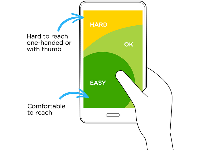
The thumb zone (pictured above) demonstrates the range of reachability for a user’s thumb while they’re interacting with their phone with one hand. It give you an idea of whether or not your primary interactions are going to cause frustration for your users.
How to use the “Thumb Zone” in your designs
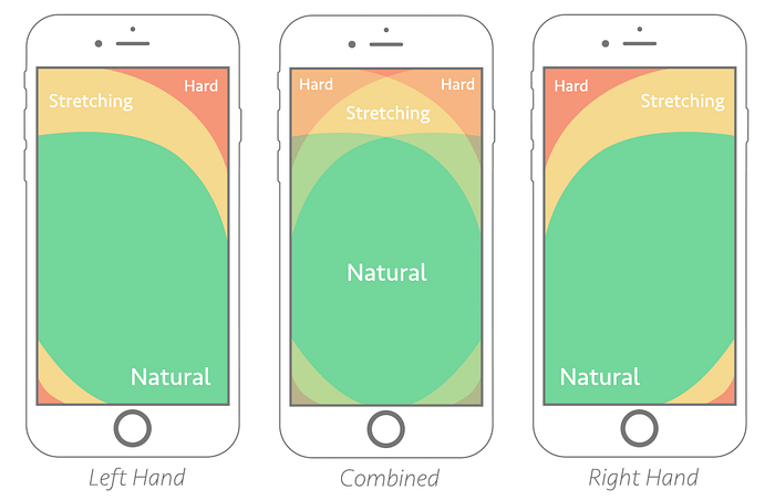
Step 1: Download Smashing Magazine’s Thumb Zone reference and insert it into your design file.

Step 2: Once you have the image file in your workspace, you can crop the phone template around the thumb zone colors, if you’d like.
Step 3: Set your transparency to around 40–50%, so that you can use the thumb zone as an overlay.

Step 4: Now you can place the overlay over your designs to see if your interactions are within reach of your users.

You can now see if your actions will cause reachability issues with your users.
Make sure to use the left and right handed overlays to accommodate all of your users or use the “combined” overlay to see how both are impacted simultaneously.
Helpful tips to keep in mind
Make sure that your frequently used primary actions aren’t out of reach. Depending on your secondary or tertiary actions, it may be okay if they’re a bit out of reach.
You may want to put destructive actions a bit out of reach, if they’re used sparingly and you want users to have a bit of friction before making that decision. Be cautious and listen to your users.
Speaking of users, try to get your design off of your screen and into your own hands to see if you run into any reachability issues. Even better, make sure to test your designs with your users and listen to their feedback.
Designing for the Thumb Zone serves as a guidance to help keep you mindful during your design process. Keep this in mind throughout your design process. Think of it as another tool to have at your disposal. It compliments well with Accessibility and Usability!
Knowing that reachability can be an issue for your users already puts you one step closer toward a better experience.
Helpful Links:
